A premium Austrian liqueur house: the first screen now shows the bottles, every page is easy to find in search, and analytics wait for consent.
 2026
The goal: keep the cream-and-gold look of the brand, show the product in the first few seconds, make every page easy to find and count visits only with consent.
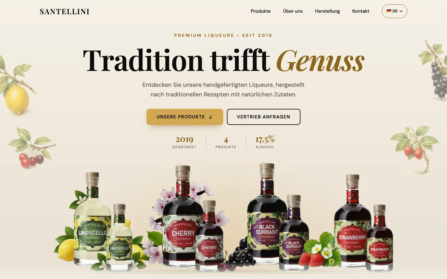
- Bottles firstThe menu is always visible and all four bottles are above the fold, with one main button and a second one for trade enquiries.
- Lighter and fasterImages became AVIF and WebP, fonts come from the site itself and the style sheet was cut down to what the pages use.
- Built to be foundSeparate German and English pages with their own titles, hreflang, structured data from real facts, a sitemap and a 404 page.
- Analytics after consentGoogle Analytics 4 runs through consent mode. Nothing is sent until the visitor presses Accept.
Lighthouse, mobile
Largest Contentful Paint, mobile
Home page, mobile
Contrast, tap targets, focus, skip link
Lighthouse 13, median of three runs, on a local build with no compression or CDN, the same server for both versions. Real-world numbers depend on hosting.
THE PAGES
Tap any page to see it large.
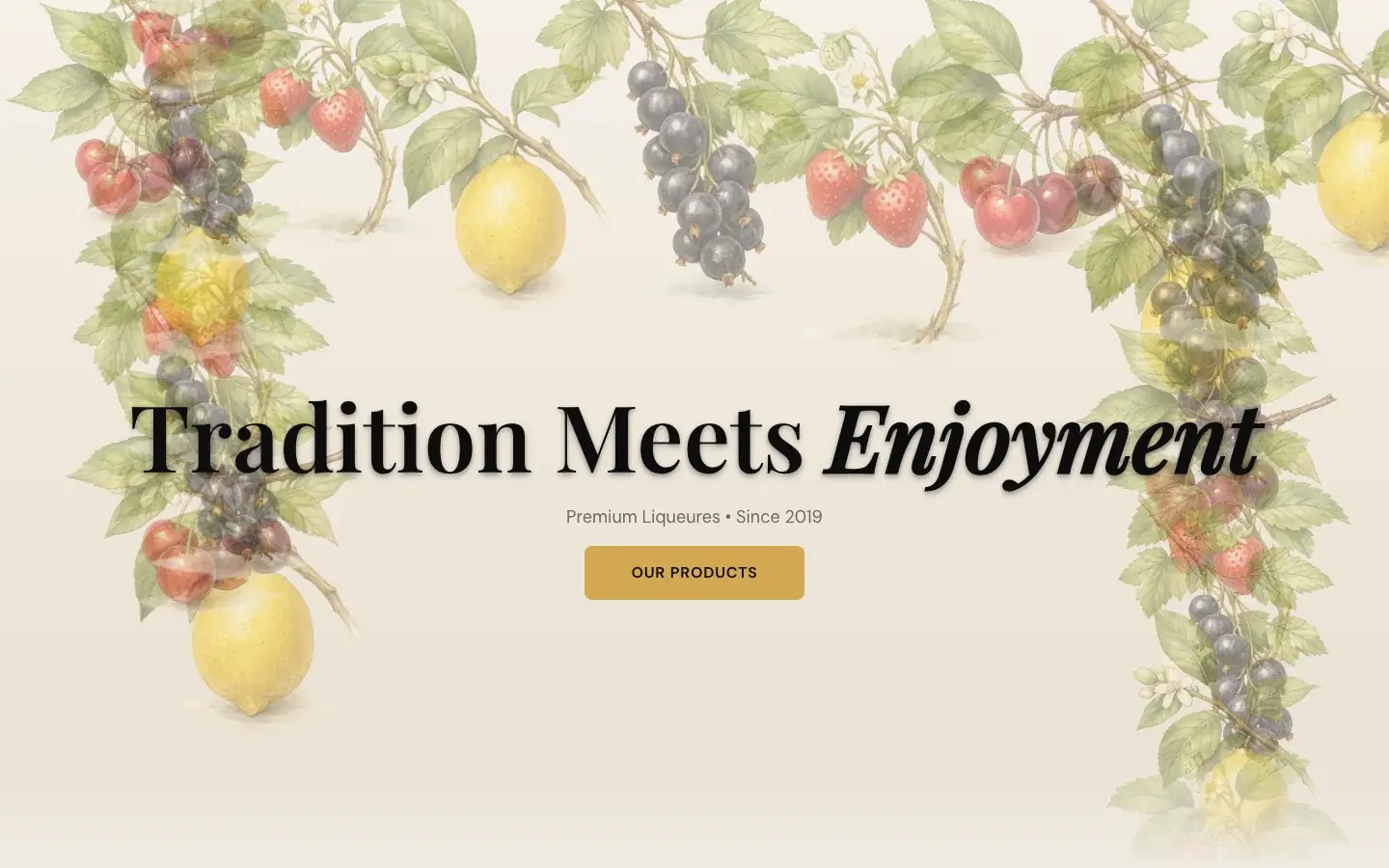
The old first screen: a headline over watercolour fruit, the menu hidden and no product in sight.
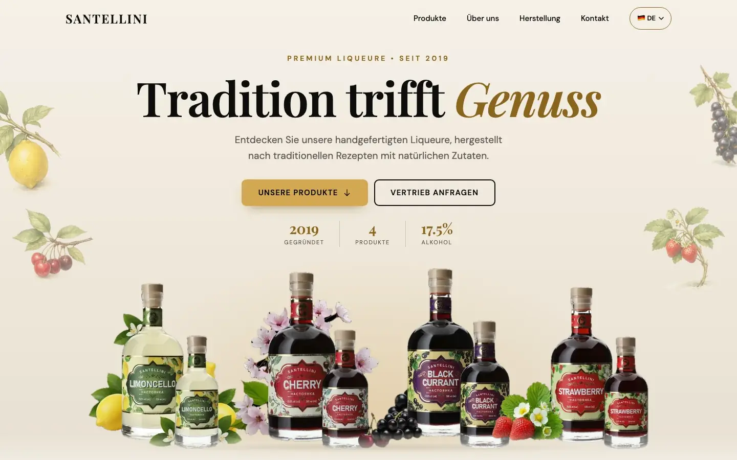
The new first screen: menu always visible, four bottles in a row, two buttons and three facts.
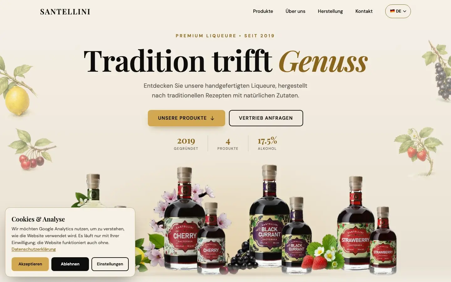
The cookies and analysis banner: Accept, Decline and Settings look equally important.
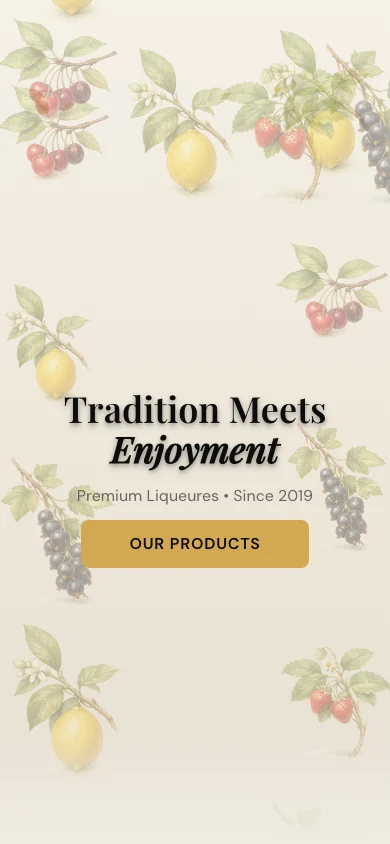
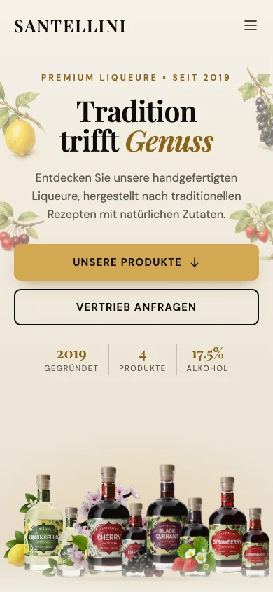
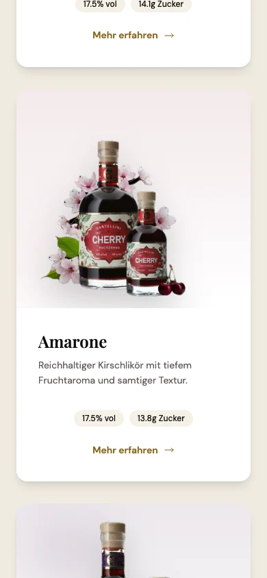
On a phone: before, after and a product card, with no sideways scrolling from 360 px wide.
The first screen after the rebuild: the thing you sell, before anything to read.
WHAT
STAYED
Palette
Typefaces
MIRROR
LINE
View case